2. Sequences of data and line charts
In this lecture we demonstrate:
- how to navigate through Jupyter notebook;
- how to represent sequences of data; and
- how to visualize sequences of data by line charts.
2.1. A bit more about Jupyter notebooks
Each Jupyter notebook is a sequence of cells, and each cell can contain some text, an expression, or a Python program. Buttons at the top of the page make it possible for you to manipulate cells. We have already used the Run button. Let us now see what other four buttons do:
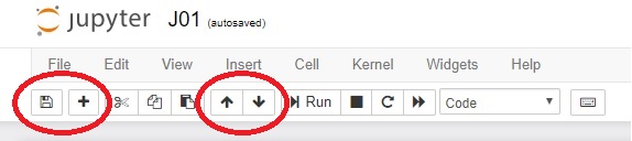
- Clicking the diskette (first button on the left) saves the notebook.
- Clicking the + adds a new cell below the active cell. (A cell can be activated by clicking on it; an active cell is framed in ***green*** or ***blue***. The difference between the two does not matter at the moment.)
- Up and down arrows move the active cell.
Imagine that, while reading this text, you suddenly felt an unexplicable urge to evaluate $1 + \frac 12 + \frac 13 + \frac 14 + \frac 15 + \frac 16 + \frac 17$. You then have to click this cell (yes, the one you are reading at the moment) and click on the + button. In the new cell that appears below you can enter the expression and Python will evaluate it for you:
1 + 1/2 + 1/3 + 1/4 + 1/5 + 1/6 + 1/7
The following eight cells contain the first few verses of a nursery rhyme. The verses are, alas, scrambled. Using the up and down arrows rearrange the cells to get the rhyme right.
Once I caught a fish alive,
Then I let it go again.
Which finger did it bite?
Why did you let it go?
Because it bit my finger so.
This little finger on my right.
One, two, three, four, five,
Six, seven, eight, nine, ten,
2.2. Representing sequences of data
A sequence of data can be represented as a list: list the numbers within square brackets. For example, in some countries students get marks as letters A, B, C, D and sometimes even F, while in other countries students get marks as numbers 5, 4, 3, 2 and 1. Marks expressed as numbers are more convenient for data analysis, so let these be the marks of a student:
marks = [2, 4, 5, 3, 5]
The system produces no output, of course. It has just registered that the variable marks contains a list of integers. Let us check that everything is as we expect it to be:
marks
It is also possible to form lists of strings, like this:
subjects = ["Maths", "English", "Art", "History", "PE"]
Let's check, just in case:
subjects
The standard function len gives back the length of a list:
len(subjects)
2.3. Visualizing sequences of data
The following cell contains the data that describe the way the population of our planet has changed in the last millenium. The numbers in the population list are given in billions:
years       = [1000,  1500, 1650, 1750, 1804, 1850, 1900, 1930, 1950, 1960, 1974, 1980, 1987, 1999, 2011, 2020, 2023, 2030, 2037, 2045, 2055, 2100]
population  = [0.275, 0.45, 0.5,  0.7,  1,    1.2,  1.6,  2,    2.55, 3,    4,    4.5,  5,    6,    7,    7.8,  8,    8.5,  9,    9.5,  10,   11.2]
We would like to visualize this data because we, the humans, find the visually represented data as the most appealing.
There are many libraries that come with Python that can help with visualizing data and we will focus on the one called matplotlib.pyplot. The name of the library is very long and complicated, and we shall have to refer to many functions from it, we shall import the entire library at once and at the same time give it a nickname plt.
import matplotlib.pyplot as plt
It is important to stress that one import per notebook suffices! Therefore, we shall import the library once and use it throughout the notebook. On the other hand, in each new notebook we have to import all the libraries we need, but only once per notebook.
One import per notebook!
If you, by accident, import the same library twice -- no worries. Python will not complain, but also will not lose time and resources to import the same library twice.
Back to drawing charts! This is the simplest way to get a chart:
plt.plot(years, population)
plt.show()
plt.close()

The function plot(years, population) tells the system that we want a chart where the horizontal axis (the $x$-axis) represents the numbers listed in years, while the vertical axis (the $y$-axis) represents the numbers listed in population. The function show then does the actual drawing. Finally, the function close cleans up the garbage left after all the computations needed to draw the chart.
The data is represented by a line. This is why such charts are called line charts.
Since this time we imported the entire library under the nickname plt the functions plot, show and close have to be addressed using both their "family name" (the library it comes from) and "first name": plt.plot, plt.show and plt.close.
Next, using the title function we shall give our chart a title:
plt.plot(years, population)
plt.title("The population of the Earth")
plt.show()
plt.close()

We can also put a label along the vertical axis to indicate that the numbers we are displaying are in billions. For this we need the function ylabel ("the label on the $y$-axis""):
plt.plot(years, population)
plt.title("The population of the Earth")
plt.ylabel("(billions)")
plt.show()
plt.close()

In conclusion: functions plot, title and ylabel add various elements to the chart, and only when all the elements have been added to the char we invoke the show function to do the actual drawing. After that we have to clean up by invoking the close function.
2.4. Exercises
Exercise 1. Look at the following code and then answer the questions:
import matplotlib.pyplot as plt
plt.plot(years, population)
plt.title("The population of the Earth")
plt.ylabel("(billions)")
plt.show()
plt.close()
- What does
import ... as ..do? - Why do we have to write
plt.plot, and not simplyplot? - What does
plotdo? - What do
titleandylabeldo? - What do
showandclosedo?
Exercise 2. The following cell contains data about weight and length/height of a boy in the first seven years of his life.
peroid    = ["6 m", "1.5 y", "2.5 y", "3.5 y", "4.5 y", "5.5 y", "6.5 y"]
weightKG  = [5.9,   11.5,    14.8,    20.5,    22.0,    24.2,    29.0   ]
heightCM  = [62.0,  84.0,    97.0,    115.0,   122.5,   131.5,   135.0  ]
Generate two charts: one to display how the weight of the boy changes over time, and the other one to display how the height of the boy changes over time.
Exercise 3. Body mass index, BMI, is the quotient of the weight (in kilograms) of a person and the height (in meters) of the person:
$$\hbox{BMI} = \frac{\hbox{weight in kilograms}}{(\hbox{height in meters})^2}$$For a boy from Exercise 2 visualize the way his BMI changed over time. The following Python program maight be helpful:
BMI = [0, 0, 0, 0, 0, 0, 0]
for i in range(0, 7):
    BMI[i] = weightKG[i] / (heightCM[i] / 100.0)**2
Exercise 4. It is estimated that on July 1st, 2019 the population of China was 1,420,062,022. It is also estimated that the population of China increases by 0.35% per year. Visualize the population of China in the following ten years under the assumtion that these parameters will not change.
